BlueCross BlueShield
BlueCross BlueShield* had no content tailored to individuals buying their own health insurance, i.e. “retail” customers. Their pages without a clear audience featured dense text, industry jargon and too many links. They asked our team to redesign it and make it simpler, more understandable, and easier to look at and scan.
I started by leading core content model workshops for stakeholders to define and prioritize key business messaging and user tasks for each site section.
Then I mapped the content to customer journeys, anticipating what users needed as they moved through enrolling, renewing or just understanding health insurance better.
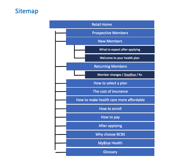
This became the foundation for a site map and our information architecture. As the sitemap took shape, I collaborated with design on creating reusable content components, lowering development costs.
To validate our design, we ran a user testing process that involved card sorting and tree testing. The card sort helped determine verbiage an insurance-buying public would use and expectations for information grouping. The tree testing showed us where users expected to find answers.
Our stakeholders loved the new, cleaner design and the savings of reusable content components. When the site initially launched, KPI’s showed a 41% increase in unique visits over the previous month.
*BCBS of Illinois, Texas, Oklahoma, New Mexico and Montana
The Challenge
The BCBS content that wasn’t directed to its Medicare or Medicaid audiences was a great illustration of “design for everyone is design for no one.” With no personalized content or clear navigational path, the site offered jargon, pages heavy on text with little white space or images, and a proliferation of left navigation links.
Comparative Analysis
As part of our discovery process, we explored other health insurance sites as well as other enrollment sites providing services, undertaking a rigorous comparative analysis.
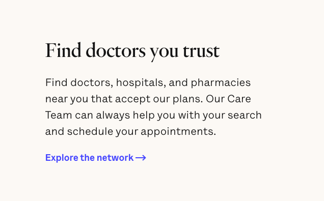
We looked at the sites we thought were crushing it, like Oscar, and used them as models. What did they have that we didn’t?
Clarity and simplicity
Imagery
Plenty of white space
Helpful explanations
Intuitive paths gently guiding users where to go next


Core Content Model Workshop
The core content model technique ensures content aligns business and user goals, with stakeholder buy-in included. I led workshops for stakeholders and copywriters, asking them to prioritize messaging for pages or sections of the site; the overlap between business and user goals became the core content.
Core Model by Netlife Research
https://alistapart.com/article/the-core-model-designing-inside-out-for-better-results/
Site map and information architecture
The site map began to take shape as we looked at the story map and saw how groupings of content made sense.
Testing, testing….
To confirm the accuracy of our findings, we carried out tests. We started with a card sort, to determine the expectations of users toward the verbiage on a healthcare site and how the information should be grouped. Previous research showed us that terminology and jargon went a long way toward obfuscating — or clarifying — the healthcare experience. Our goal was to simplify and illuminate so that users could actually understand what they were buying and doing.
Our second proving ground was a tree test, where we asked users to limn the path they would take to purchase or make use of their health care plan. Results revealed a key challenge: the difference between content explaining what the plan did versus instructions for its actual use. Design, both in terms of content and visual, can help users differentiate between them so that they can get what they need as quickly and easily as possible.
Launched!
Dan Kim, senior manager of interaction design, HCSC


